
Pop-up Builder
Pop-up builder allows to create nice looking pop-up windows that will attract every website visitor and are likely to encourage them to interact. You can add text, fields, buttons and images to your pop-up as well as backgrounds and columns.
It's fast, with no need to hire developers and designers.
To create a pop-up, go to "Triggered message" section and press "Create message". When on the step "Content" choose Pop-up builder and choose what size do you want it to be:
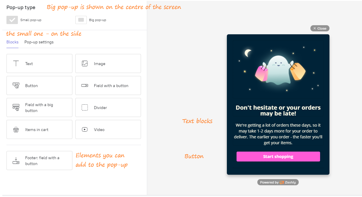
- Big pop-up is shown in the center of the screen and blocks other objects. It attracts attention the most, but distracts your visitors from what they were doing, so a lot of big pop-ups may be annoying.
- Small pop-up is shown on the side of the screen and doesn't distract from interactions with website.
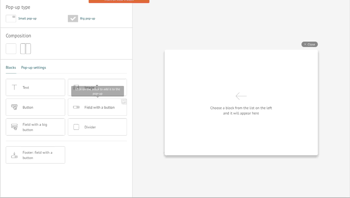
You see available blocks to add to your pop-up on the left and the preview of your pop-up on the right.
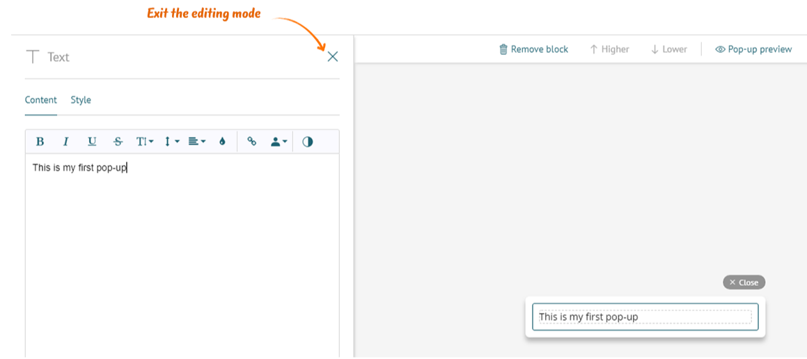
Click on the block to add it to a pop-up. To exit the editing mode, press a dash.
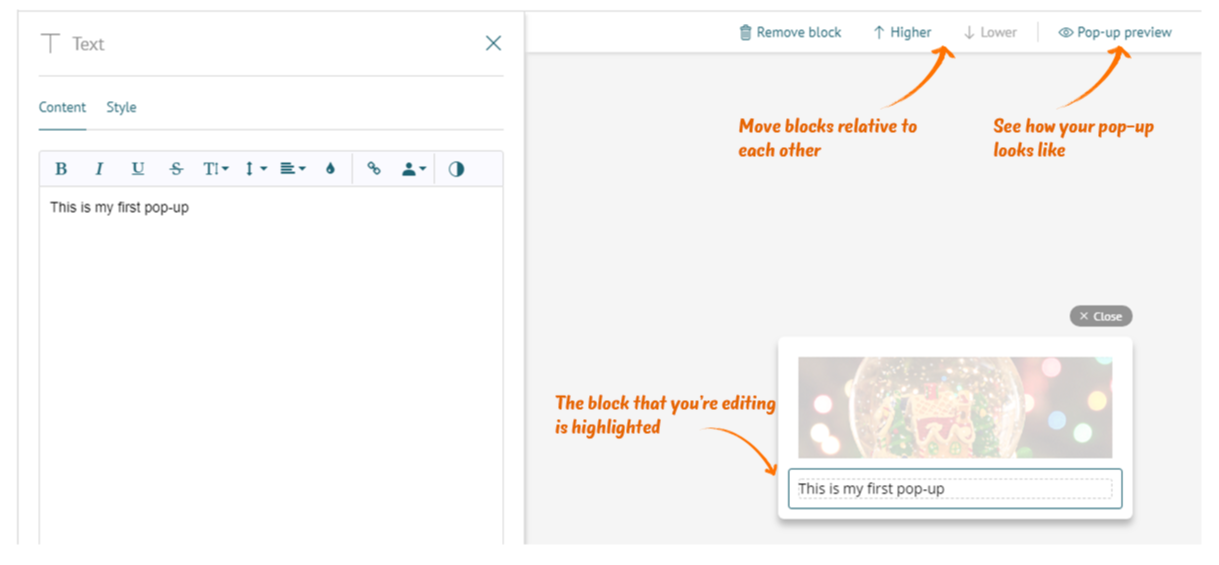
If several blocks are added, you can edit each of them by clicking on parts of the layout on the right (except for the preview mode).
Active blocks are highlighted and framed. To see how the pop-up will look on a website, click “Pop-up preview”. You can also remove blocks and move them relative to each other.
Most of the blocks have a “Style” tab in addition to the Content, where can select the background colors of a pop-up/button/field and other appearance settings.
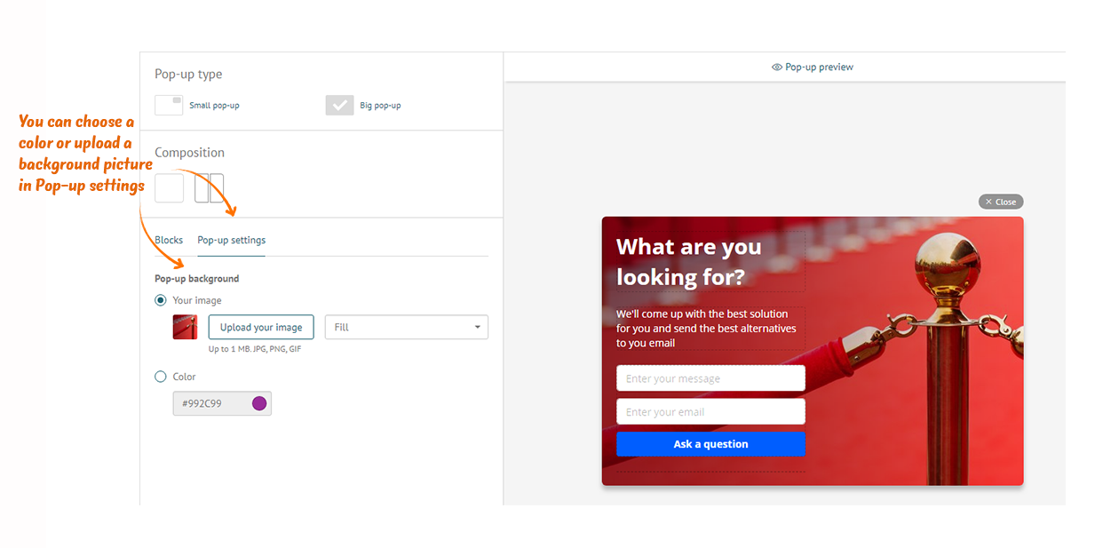
◾ Pop-up background
Go to the pop-up settings and set the background image or select a color.
The height of the pop-up depends on the number and height of the blocks, and the width depends on the type of the pop-up:
- Big pop-up 580 px;
- Small pop-up 350 px.
Unlike the image block, the background fills all the space of the pop-up. You can choose how to lay your image.
◾ Columns
In a large pop-up, content can be placed in one column or two. Select the composition you want to use. A new block will be added to the last active column. Move them using the buttons (in addition to the "higher" and "lower", you will be able to move them "left" and "right").
This is a pop-up with one column:
And this one has two columns:
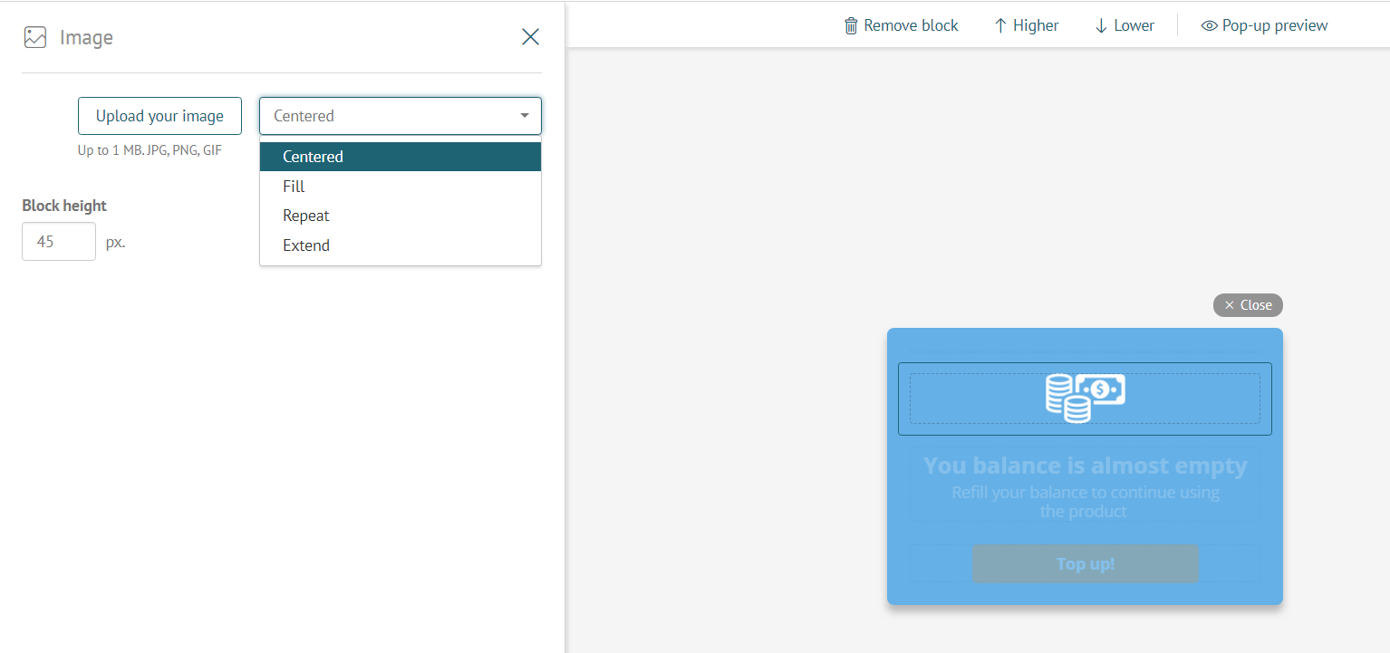
◾ Image
Upload your picture and select its layout:
- Centered
- Fill;
- Repeat;
- Extend.
The width of the block is fixed, but you can choose its height (100 px by default).
If you selected a centered image and it turned out to be small, correct the height of the block (almost certainly this will fix the problem).
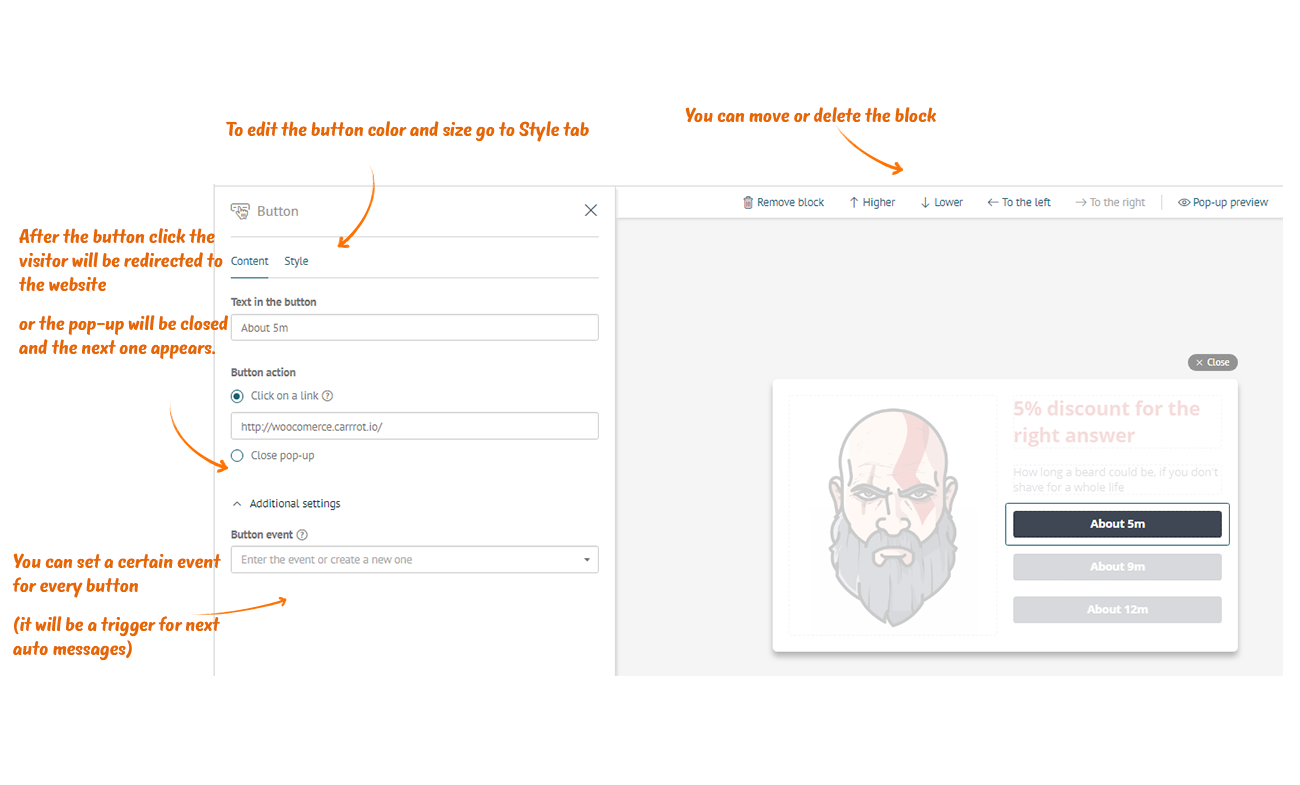
◾ Button
You can add any number of buttons to a pop-up. This is convenient if you want to offer customers a choice or play a game with them.
For each button, you have to select the action that occurs after clicking on it:
- Click on a link (paste the link in the box below);
- Close pop-up (if visitors don’t need to perform any more actions or you want to show the next pop-up).
❗Important: Set a different event for each button in order to record them into a visitor's card (use them for segmentation as triggers for message chains and building funnels).
You can create new events, for example, "5-10 team members" or "Clicked on answer 5" or choose one event from those you already have.
This is especially important in the case of several buttons in a pop-up, because this is the only way to separate clicks from one another. In case of a single button, you can choose an event for the button (we recommend this option) or set "Events for message chains" on the last step of triggered message settings.
◾ Field with a button
You can insert the field where there's a button on the right. Any information can be put there: emails, telephones, short answers and everything else that comes to mind.
❗ Important: it is necessary to select a property to where information from the field will be recorded. You can select from existing properties (for example, "email" or "phone") or create new ones (for example, "review"). Properties are required for segmentation, as well as for message personalization.
After adding the “Field with a button” block, other blocks with field insertion will not be available: “Field with a big button”, “Field with a button” and “Footer: field with a button”, since there can be only one type of field in a pop-up.
In the Style tab you can customize the block and change the following colors:
- Field border color
- Background Color
- Field text color
- Button color
- Button text color
◾ Field with a big button
This block is perfect because you can create an unlimited number of fields in it. Information from all fields will be recorded simultaneously after the button clicks. Create questionnaires (for example, name, phone, email), and record the information from each field to a separate lead property.
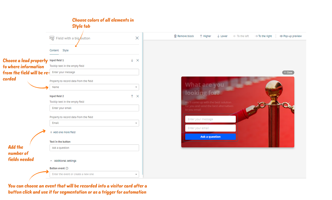
Restrictions and style settings are the same as in a previous field.
◾ Divider
This is an empty block which height can be adjusted. It is convenient to use it to separate some objects from others or to regulate top and bottom fields of a pop-up.
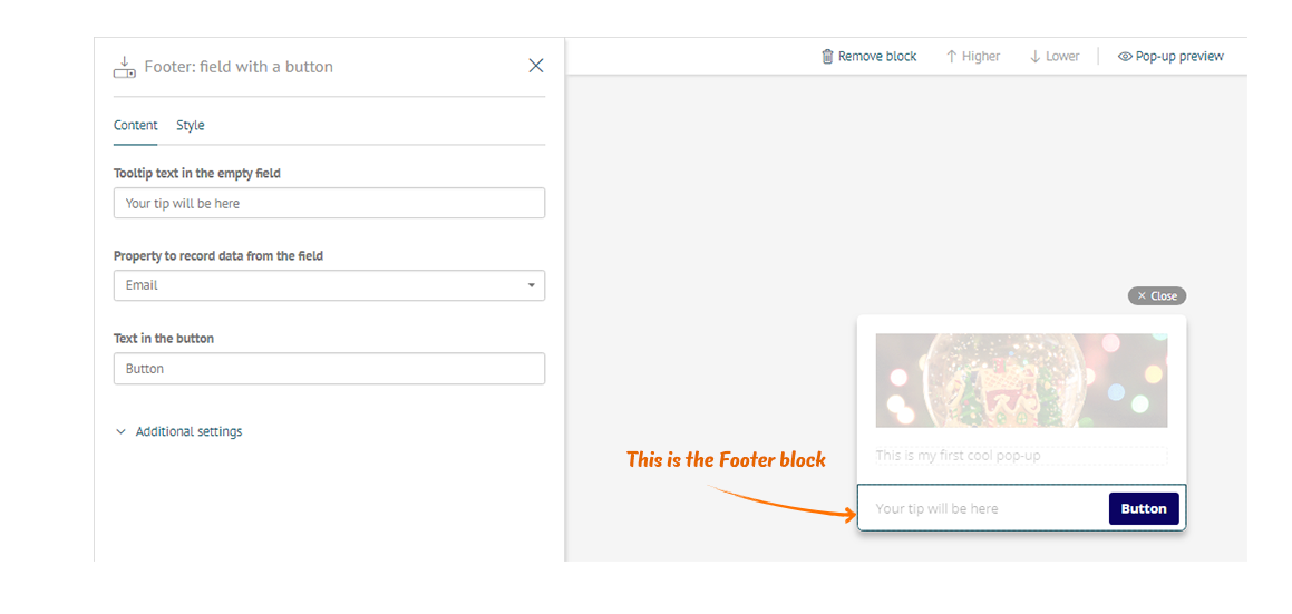
◾ Footer: field with a button
The footer contains only one field with a button and is located at the bottom of a pop-up, under the dividing line. You cannot insert blocks below the footer.
If you make a long pop-up that scrolls, the footer will be located at the bottom and will not scroll.
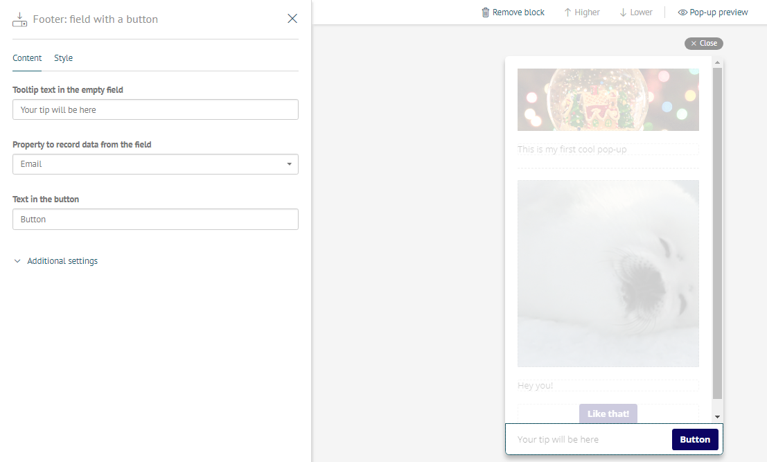
An example of a big pop-up that scrolls with the footer:
◾ Items in a shopping cart
You may set a reminder for your visitors about goods they have added to their cart to increase conversion to checkout. If you’re using system event “Added to cart”, just add a block with goods from a chart into a pop-up. We’ve added this block as an example for you to get the idea how it would look like. When you launch a pop-up on your website, your user will see those goods which they added to the chart, not the one you see in example.
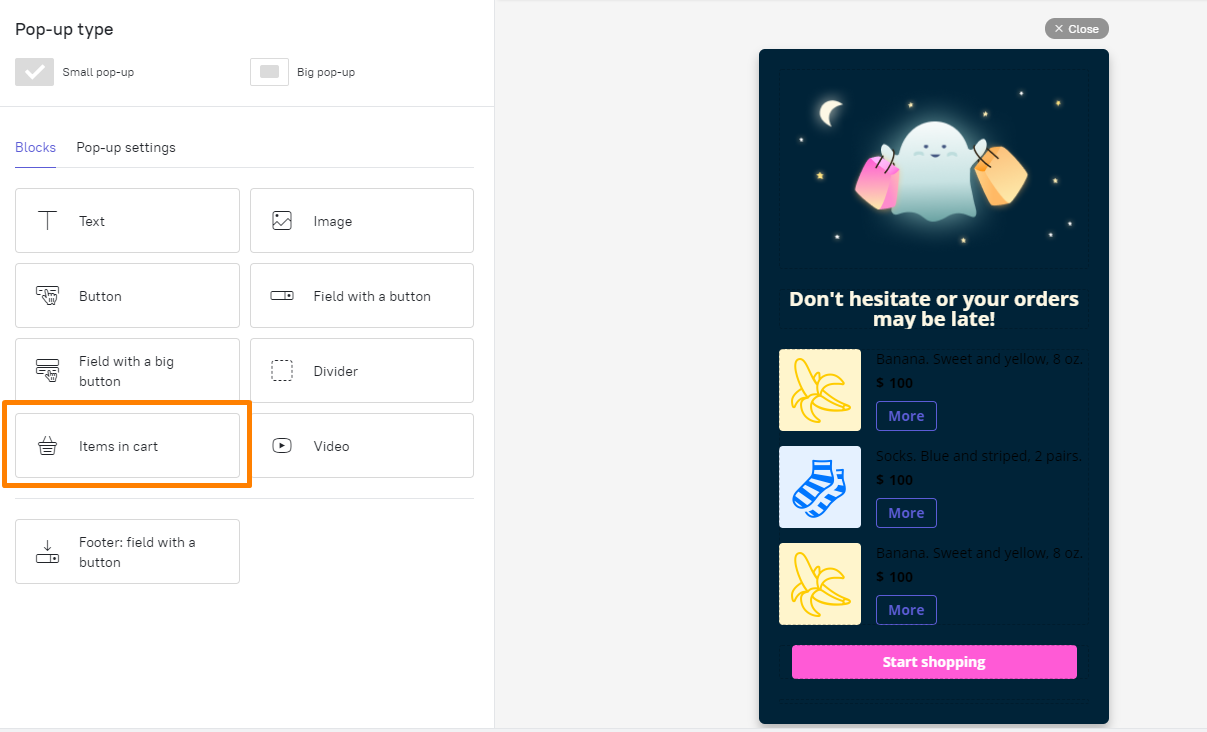
Info about the goods in a cart will be achieved from from a system event $cart added. If an integration with CMS (InSales, Bitrix, Opencart, Wordpress) is set, this event will be collected automatically and you can easily integrate this block into your pop-ups. If you set up data acquiring yourself, you need to check if there is a system event is being collected, or the custom one.
If you see a warning that your event doesn’t work, there are a few possible reasons for this:
- This event has never been activated before. You can easily check this by adding an item to cart on your web site. After that an event will be added to your card, and after you reload the page the warning will disappear (important: all the unsaved changes will be lost after you reload the page. So if you made any changes - save before reloading). If a warning still remains you have one of the following options.
- Event configuration is wrong. After you added any good to your cart there were no events added to your card. Check your event settings or write down to us - we will help you.
- You are creating a custom event “An item added to cart”. Block with products won’t work. You need to reconfigure an event to be collected. There is an instruction how to configure it through WEB API or master of data gathering.
◾ Editing the block
You can change design of the block. Choose the number of products can be shown in a pop-up, 30 max. The latest added to the cart will be put in there. If user have lesser number of products he will see all of them in a pop-up. It’s important to remember that after a certain level of height a scroll will appear in a pop-up. That’s why we prefer choosing a lesser number of products to avoid this.
Choose a currency displayed on a price tag. If the currency you are looking for not presented in the list, then pick “Another currency” and type it’s name.
On a “Style“ tab you can change the color of the buttons and text (name and price). Product pictures would be those you are sending to an event.
◾ Configure items in a cart pop-up correctly
It’s important to remember that a pop-up with this block can only be shown to users who added any product in their cart, or they will see an empty pop-up. So let’s find out how to create triggered message correctly.
The easiest way is to use presets.
Decide when do you want to show pop-up.
Here are some popular triggers:
- Leaving the page
- Second visit
- User added products to the cart but didn’t proceed to checkout, while still staying on a website.
Due to the trigger choose a time out (when user is trying to leave the site pop-up should be shown immediately, in other cases there could be a delay).
In the target audience settings you need to set following points:
- User added products to a cart (last action) less than [time period].
- User placed an order (last action) more than or uncertain [time period].
Example: last time a product user added a product less than 30 minutes and a last order is being made more than 3 days ago - this means , that he definitely have products left in his cart. If you want to catch users during their next session, you can increase time period, for a week for example. Anyway, it’s important, that an event a product been added after an order or order as an event wasn’t made at all (“More or undefined” filter to use in this case).
We recommend to test pop-up on yourselves before launching, to be sure, that all the goods are placed correctly. You can do so by adding your e-mail in a user characteristics or in it’s card. Then test all the triggers and conditions and check how the pop-up looks like.
◾ Video
Video attracts attention and engages more actively than pictures and texts. We support inserting links to videos from Youtube and Vimeo. You can set the video to play automatically as soon as it is delivered to the user, but in this case the sound will be turned off so as not to be annoying or distracting. If necessary, the user themself can turn on the sound or stop the video.
We support all Youtube and Vimeo video options. For example, you can set the moment from which the video will be played, or the colors of the player. You can find a complete list of parameters in the official Youtube and Vimeo documentation.
Good luck with your creations!